
How to Organize a Menu: Categories & Order
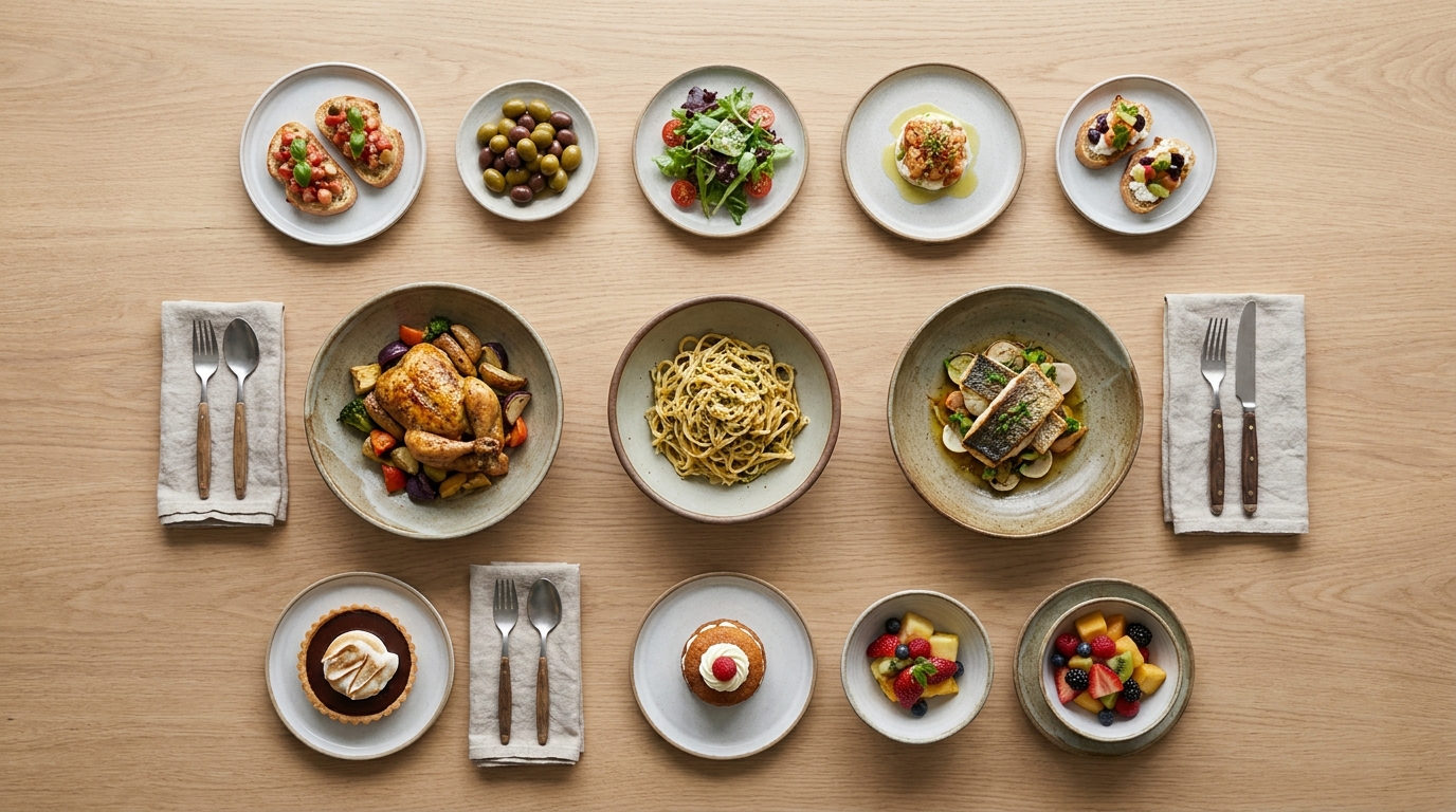
Guests do not read a menu; they scan it. How you group your dishes and what order you put them in decides what they notice, what they skip, and what they order. Organizing a menu is not decoration — it is merchandising, and on a digital menu the rules are slightly different from paper. Here is how to structure yours so the dishes you want to sell are the ones guests see first.
TL;DR — Key Takeaways
Categories are navigation. Group dishes the way guests think — Starters, Mains, Sides, Drinks, Desserts — not by how the kitchen is laid out.
Five to seven items per category. Enough to feel complete, few enough to avoid decision fatigue, which measurably lowers orders.
Order sells. The top of each category gets the most attention; put your high-margin signatures there, not your cheapest item.
Sequence categories by the meal. Lead with what people order first; keep add-ons like sides and drinks easy to reach.
Name sections in guest language."From the Grill" beats "Hot Kitchen 2"; clarity always outsells cleverness.
Why menu structure outsells menu design
You can spend a week on fonts and colors and move the needle less than you would by reordering two sections. That is because attention on a menu is scarce and predictable: guests land, skim for the category they want, glance at the first couple of items, and decide. Everything below the fold of a section competes for whatever attention is left.
So the job of organizing a menu is to put the right dishes in the path of that attention. Get the categories clear, keep them short, and order both the sections and the items deliberately. Do that and you have done more for revenue than any visual polish — and it costs nothing but thought.
Step 1 — Choose categories guests already understand
Group dishes by how a guest mentally sorts them, which is usually by course or by craving: Starters, Salads, Mains, Sides, Desserts, Drinks. A specialist concept gets specialist sections — From the Grill, Bowls, Flatbreads — but the test is the same: would a first-time guest know what is in this section from the name alone?
Avoid internal or cute labels. "Hot Kitchen" and "Chef's Corner" make guests work; "Mains" and "From the Oven" do not. If you serve distinct dayparts, separate them (Breakfast, Lunch, All-Day) so guests are not scrolling past brunch at dinner. Clear beats clever every time, and it translates better too — a vague category name becomes a vaguer one in another language.
Step 2 — Keep each category to 5–7 items
This is the rule operators most often break and most benefit from fixing. More choices feel generous but read as work; past about seven options in a section, decision fatigue sets in and orders actually drop. A tighter menu also runs better — fewer SKUs, less waste, more consistent execution, and ingredients that cross over between dishes.
If a category is bloated, cut to your best performers and roll the rest into specials or seasonal features. You are not removing revenue; you are concentrating attention on the dishes that earn it. A menu of five strong sections with six items each reads as complete and confident — and it is far easier to keep photographed, described, and translated.
Step 3 — Order categories to match how people eat
Sequence your sections in the order a guest builds a meal. Most rooms lead with Starters or Signatures, move through Mains and Sides, and finish with Desserts and Drinks — though a bar flips that, leading with drinks. Put your strongest, most representative category near the top: it sets the tone and is what a scanning guest sees first.
Keep your highest-margin add-on categories — sides, drinks, desserts — easy to find rather than buried at the bottom, because they are where the check grows. On a digital menu, the category bar at the top makes this easy: guests can jump to a section, but the default order still frames the meal.
Step 4 — Order items to put your money-makers first
Within each category, position is power. On a printed page, the "golden triangle" describes where eyes travel — center, then top-right, then top-left. On a digital menu, that concentrates into the top of each category: the first one or two items in a section get a disproportionate share of attention.
So lead each category with a "star" — a dish that is both popular and high-margin — rather than your cheapest or most obvious option. Use the second slot for another strong performer. Bury low-margin or rarely-ordered items lower down. This is the merchandising layer of menu engineering; for how placement and price interact, see menu pricing psychology.
Step 5 — Name and describe so the structure pays off
Clear category names do half the navigation; clear item names and one-line descriptions do the rest. A dish that needs explaining gets skipped, so either rename it plainly or add a short description that earns the order. Structure and copy work together — a perfectly ordered menu still underperforms if the items read as a mystery. The how-to is in how to write menu descriptions that sell.
A well-organized sample menu
SIGNATURES— Mixed Grill (for two) · Lamb Kofta · Shish Tavuk
STARTERS— Hummus · Baba Ghanoush · Halloumi · Fattoush · Soup of the Day
MAINS— Chicken Shawarma · Falafel Plate · Grilled Sea Bass · Veggie Bowl
SIDES— Fries · Rice · Arabic Bread · Garlic Sauce
SWEETS & DRINKS— Baklava · Ayran · Mint Lemonade · Tea
Notice the choices: a Signatures section up top to lead with strength, five sections total, nothing over five items, and sides and drinks grouped where the check grows. That is an organized menu — and it is the structure you replicate when you build it digitally, covered end to end in the complete guide to creating a digital menu.
How many categories should a menu have?
For most independents, four to six categories is the sweet spot. Fewer than four and the menu feels thin or forces unrelated dishes together; more than six or seven and guests have to scroll past sections they do not want. The right number is the smallest set that lets every dish sit in an obvious home.
Section order by restaurant type
The principle — lead with your strength, keep high-margin add-ons easy to reach — holds everywhere, but the running order shifts by concept:
Full-service restaurant: Signatures or Starters → Mains → Sides → Desserts → Drinks. Lead with the section that defines you.
Café / coffee shop: Hot Coffee → Cold Drinks → Food (pastries, toasts, lunch) → Tea & Other. Drinks are the hero here, so they come first.
Bar: Signature Cocktails → Classics → Beer & Wine → Bar Food. Flip the usual order: drinks lead, food supports the session.
Quick-service / takeaway: Combos & Meals → Mains → Sides → Drinks → Desserts. Put the highest-value meal deal first to anchor the order.
Pizzeria: Signature Pizzas → Build-Your-Own → Starters → Sides → Drinks & Dessert. Lead with the thing you are known for.
The logic never changes — put what you want to sell, and what defines your concept, in the path of attention. Only the labels and the sequence adapt to how guests at your kind of venue actually order.
What changes on a digital menu vs. paper
A few habits carry over from paper, and a few should be dropped. The "5–7 items per category" and "signatures up top" rules apply on both. But a digital menu adds a sticky category bar at the top, so guests can jump straight to a section — which means clear, well-named categories matter even more, and a long menu is less punishing as long as each section stays tight. You also lose the fixed two-page spread, so there is no "back page" to bury things on; everything is one scroll, and position within each category — reinforced by a photo on your stars — is what controls attention. Design for the thumb, not the spread.
The psychology behind menu structure
These rules are not arbitrary; they follow how people actually decide under mild pressure — exactly the state a guest is in when a server is hovering. Three forces are at work. The first is decision fatigue: every additional option a guest weighs costs a little mental energy, and past a handful of choices the easiest decision becomes no decision — they default to the familiar or ask for "a minute." Trimming a category to five or seven items is not about offering less; it is about making the choice feel effortless so it actually gets made.
The second is attention scarcity. A guest does not read a menu top to bottom — they sample it, landing on the start of each section and skimming down until something stops them. Whatever sits in that first glance gets ordered far more often than whatever sits below it, which is why position is worth more than any font choice. The third is anchoring: the first price a guest sees in a section frames every price after it, so leading with a strong, fairly-priced signature makes the rest of the section feel reasonable.
Structure your menu with these in mind and you are not manipulating anyone — you are removing friction so guests order what they would have wanted anyway, faster and more happily. That is the difference between a menu that merely lists your food and one that helps guests choose it.
Common menu-organization mistakes
Categories named for the kitchen, not the guest. Guests do not know what "Station 3" is.
Overstuffed sections. Ten mains do not sell more than six; they sell less, slower.
Best dish buried mid-list. If your money-maker is item nine, almost no one sees it.
No order logic. Random sequencing makes guests work and flattens your highest-margin add-ons.
One giant "Food" category. Without sections, a digital menu becomes an endless scroll with no signposts.
Organize your menu free with Intermenu
Intermenu makes structure effortless: create categories, drag items into the order that sells, and reorder sections in seconds — then see in the analytics whether the change worked. Pair clean structure with photos, allergen tags, and translation, all from one dashboard.
Build your digital menu free with Intermenu →
Frequently Asked Questions
How do I organize a restaurant menu?
Group dishes into clear, guest-friendly categories (Starters, Mains, Sides, Drinks, Desserts), keep each to about 5–7 items, order the sections to match how people build a meal, and lead each category with a high-margin signature dish.
How many items should be in each menu category?
About five to seven. It reads as complete without triggering decision fatigue, and it keeps your kitchen focused and your menu easy to photograph, describe, and translate.
What order should menu categories be in?
Follow the meal: starters or signatures first, then mains and sides, then desserts and drinks (bars lead with drinks). Put your strongest category near the top and keep high-margin add-ons easy to find.
Where should I put my best-selling dishes?
At the top of their category. The first one or two items in each section get the most attention, so that is where your popular, high-margin "stars" belong.
How many categories should a menu have?
For most independents, four to six. It is the smallest number that still gives every dish an obvious home without making guests scroll through sections they do not want.