
How to Add Photos to Your Menu (incl. AI Photos)
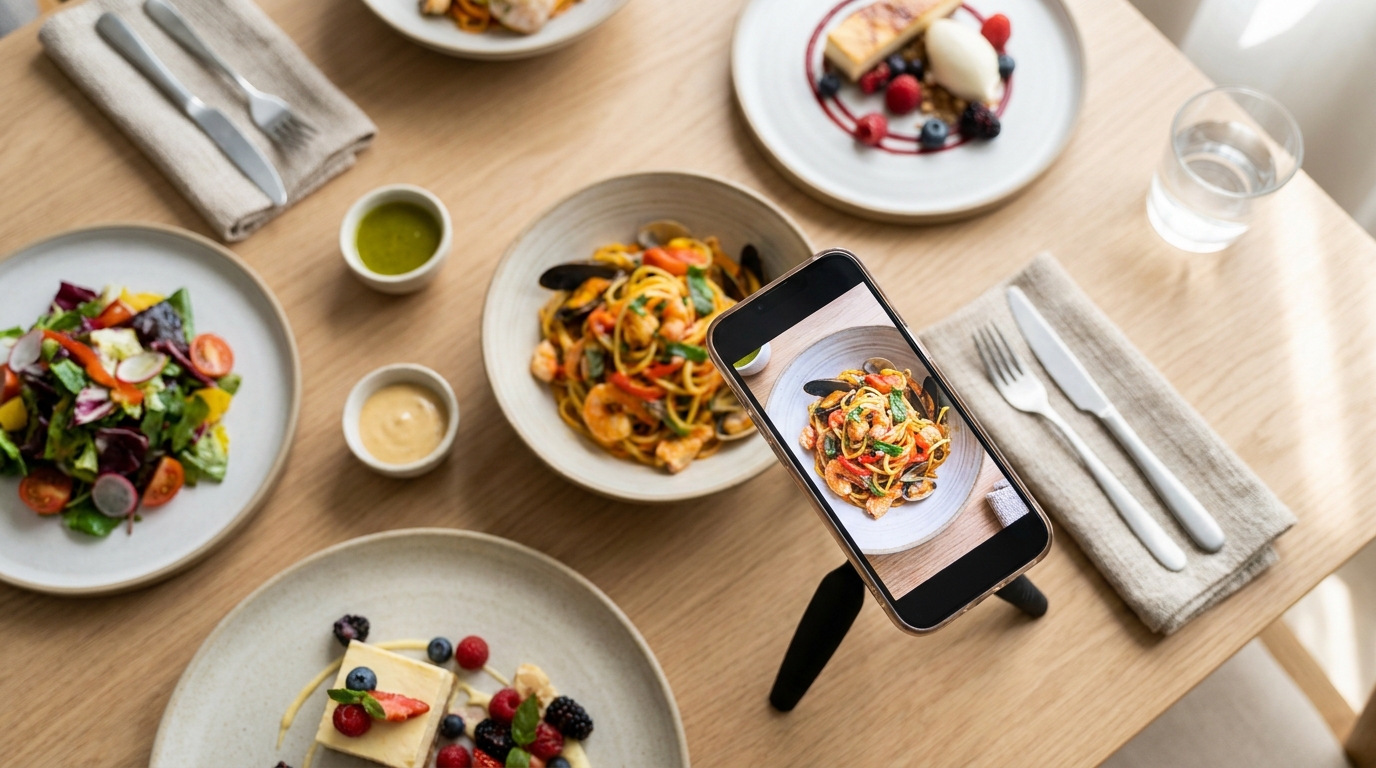
Most AI food photos fail for one reason — the prompt names a dish and stops there. These thirty do the rest of the work for you: angle, light, surface, props, depth of field and mood. Swap in your dish name and paste.
TL;DR — Key Takeaways
The craft variables are the prompt."A photo of lamb tagine" returns a stock photo. Angle, light, surface and mood return your restaurant.
Photograph what a guest can't picture. A photo lifts orders on that dish by roughly 25–30%, most of all on unfamiliar items.
Square for the menu, tall for the phone. Dish photos sit in a square tile; stories and posters want a vertical frame.
AI images are representative, not documentary. They look like the category of dish, never the exact plate your kitchen sends.
In the dish editor you write no prompt. These thirty are for the promo image studio and any other tool you use.
Why a photo earns its place on a dish
A photo is the strongest element on a menu row, and the lift is real — roughly 25–30% on the dish that carries one, and far bigger on items a guest can't already picture.
So the order matters more than the count. Shoot the unfamiliar first — the labneh with za'atar oil, the sea bream crudo, the regional pasta shape nobody outside your province knows. Leave the club sandwich for last.
If your menu is live, the dishes nobody ever opens are already listed for you; that list plus your margins is your order of work — see what a digital menu tells you that paper can't.
A real photo always beats a generated one. These prompts are for the dishes you were never going to shoot; the wider job sits in how to digitize your restaurant menu.
Which dishes get a photo first
Not every dish needs one, and the monthly image allowance is finite on every plan. Spend it in this order.
The dish a guest can't picture. A regional shape, an untranslatable name, something you invented. The 25–30% lift works hardest here: the photo isn't decorating a decision, it's making one possible.
Your highest-margin plates. Rank by what a plate leaves behind, not by what sells most.
The signature. The dish you want named when someone describes you to a friend.
Anything the insights say nobody opens. Your menu report lists them. Some are dead weight; the rest are usually good dishes with a name that gives a guest nothing to hold onto.
Last, the obvious. Nobody needs help picturing fries.
And there's a cost to going all the way down that list. A menu where every dish has a photo flattens its own hierarchy. Photos are how an eye picks a winner out of a section; when all eight rows carry one, the eye has nothing to grab. If everything shouts, nothing does.
Where a prompt matters, and where it doesn't
In the dish editor, you write no prompt.Intermenu builds the request from what the menu already knows — name, description, preparation notes and diet tags — and places a square, photorealistic picture on the dish. Right after a photo or PDF import it offers to do that for up to 25 newly imported dishes at once; see turning a PDF or photo menu into a digital one.
The thirty below are for everything else— the promo image studio, where you describe the picture in your own words, and any other generator you use.
Paste one whole, swap the bracketed placeholder, change nothing else on the first run. Each is tagged square, the shape a dish photo sits in, or tall, what a phone-first post or poster wants.
Writing the dish description so the AI writes a better photo
In the dish editor you write no prompt — but you write the prompt's raw material. Intermenu builds the request from the dish's name, description, preparation notes and diet tags, so the quality of those four fields is the quality of the prompt.
"Pasta with sauce" returns exactly what it describes. "Hand-cut pappardelle, slow-braised beef shin ragù, shaved pecorino" returns a wide flat noodle, a dark shredded braise and a pale hard cheese. Same button, different picture.
Preparation notes count too: "finished in the pan with butter and the braising liquid" tells the generator about gloss.
The happy accident here is that this is the same work as writing menu descriptions that sell. Sharpen the description and you improve the photo, the guest's understanding and the translation in one pass.
Better descriptions pay three times— the photo improves, the guest understands the dish without asking a server, and the translation has something real to work from.
Hero dishes on a plate
Five tempers for the same job — one plate as the main event.
1. The 45-degree signature — square
45° on [DISH], matte cream plate, warm oak table. Soft window light from the left, shadows to the right. Linen napkin, steel fork. Shallow depth of field. Warm, inviting. No text.
2. Moody and low-key — square
Eye-level, straight-on [DISH], dark slate on black stone. One hard backlight from the right rims the food; deep foreground shadow, a wisp of steam. Medium depth of field. Dramatic. No text.
3. Bright and clean — square
Overhead [DISH] on a wide white rim plate, pale terrazzo. Bright high-key light, almost shadowless. One small spoon lower right, nothing else. Sharp front to back. Catalog-clean. No text.
4. Rustic, low angle — square
Low three-quarter angle on [DISH] in rough stoneware on weathered pine. Warm golden side light from the right, long shadows. Linen cloth, coarse salt. Shallow depth of field. Homey. No text.
5. Straight off the pass — square
45° documentary shot of [DISH] on a brushed steel kitchen pass. Cool light above, warm glow behind, crisp highlights on the steel. Blurred ticket rail. Medium depth of field. Candid. No text.
Drinks and coffee
Drinks sell on light, not composition: glass, foam, ice and condensation each need it doing something.
6. The morning latte — square
Eye-level, straight-on [DRINK] in a heavy cup with latte art, white marble counter. Backlit window, halo through the steam. Saucer, folded cloth. Shallow depth of field, café blurred behind. Calm. No text.
7. Iced and sparkling — square
45° on [DRINK] in a tall glass over crushed ice, heavy condensation, dark walnut bar top. Hard light from the right catching every droplet and ice edge. Shallow depth of field. Refreshing. No text.
8. Espresso flight — square
Overhead flat-lay of [DRINK] as three small glasses in a row on raw concrete. Soft even overcast light, wide negative space. One coffee bean, one spoon. Sharp front to back. Minimal. No text.
9. The evening cocktail — tall
Vertical, eye-level [DRINK] in a coupe on polished black bar top. One hard backlight rims the liquid and glows the garnish; everything else dark. Shallow depth of field, warm bokeh behind. Low-key. No text.
10. Fresh and high-key — tall
Vertical 45° on [DRINK] in a clear glass, pale white oak table. Bright high-key daylight from a window on the left, soft shadows. Fresh fruit and mint scattered around. Shallow depth of field. Summery. No text.
Flat-lays and spreads
Use these when the table is the point rather than one plate.
11. The full table — square
Overhead flat-lay of a spread centered on [DISH] — side plates, bread, small bowls, two wine glasses on linen. Soft diffused daylight from the left. Sharp front to back so every plate reads. Abundant. No text.
12. Dark mezze — square
Overhead flat-lay of [DISH] with five sharing bowls packed tight on a charcoal stone slab. One warm pool of overhead light falling to darkness at the edges. Scattered herbs, oil highlights. Medium depth of field. Rich. No text.
13. Brunch with room to write — tall
Vertical overhead flat-lay of [DISH] with coffee, juice and a pastry in the lower two-thirds, pale ash wood. Bright high-key morning light, top third empty as clean negative space. Sharp throughout. Relaxed. No text.
14. Texture from above — square
Overhead [DISH] with sides and condiments on a floured steel work surface. Hard raking light from the upper left, crisp shadows showing every ridge and crumb. Medium depth of field, tight crop. Bold. No text.
15. Takeaway, unstyled — tall
Vertical overhead flat-lay of [DISH] in open kraft containers on brown paper, napkin and wooden fork askew. Flat natural daylight, nothing aligned. Sharp front to back. Casual, street-food energy. No text.
Texture and close-ups
Macro sells what a description can't — the pull, the crust, the char.
16. The pull — square
Extreme close-up 45° macro of [DISH] being lifted, cheese or sauce stretching in a long strand, steam rising. Hard side light from the right freezes the highlight; warm dark background. Very shallow depth of field. Indulgent. No text.
17. Crust and crumb — square
Straight-on macro of a cut section of [DISH] on a dark slate board. Hard raking light from the far left puts every crumb in relief. Very shallow depth of field, near-black background. Artisanal. No text.
18. The pour — tall
Vertical eye-level macro of sauce pouring over [DISH], the stream frozen mid-fall. Backlit so the pour glows against a dark background. Very shallow depth of field on the point of contact. Glossy. No text.
19. The garnish — square
Overhead macro filling the frame with the top of [DISH] — herbs, citrus zest, cracked pepper, still dewy. Soft cool north-window light, even shadows. Shallow depth of field, plate edges out of focus. Precise. No text.
20. Char and smoke — square
45° macro of [DISH] off the grill, dark char marks, glistening surface, thin smoke drifting through frame. Warm hard light from the back left glowing through the smoke. Shallow depth of field. Smoky. No text.
Social and story formats
All vertical: the subject sits low and the top of the frame stays clear.
21. Story hero with headroom — tall
Vertical [DISH] in the lower half of the frame on a dark textured table, top third clean and empty for a headline. Soft directional light from the upper left, gradient falloff. Shallow depth of field. Premium. No text.
22. The guest's view — tall
Vertical eye-level shot from a seated diner's perspective: [DISH] in the near foreground, warm blurred dining room and a second place setting behind. Evening light, amber bokeh. Very shallow depth of field. Intimate. No text.
23. Service in motion — tall
Vertical candid of [DISH] set down on the pass, steam rising, a chef's white sleeve exiting the frame edge, no hands visible. Cool overhead kitchen light, slight motion blur. Medium depth of field. Urgent. No text.
24. Seasonal styling — tall
Vertical 45° on [DISH], dark rustic table styled for the season — dried leaves, a candle, a woven runner. Warm low-key light from one source at the right, amber tones. Shallow depth of field. Cozy. No text.
25. The full order, stacked — tall
Vertical shot of one complete order — [DISH] with a side and a drink — staggered from lower foreground to upper background on plain concrete. Soft overhead daylight. Medium depth of field so all three read. Value-forward. No text.
Event posters and promos
Generate the picture here, not the words. Type goes on afterward.
26. Poster background with a color block — tall
Vertical [DISH] in the bottom third against a solid deep burgundy backdrop filling the upper two-thirds as flat color. Soft studio light from the upper left, one soft shadow under the plate. Shallow depth of field. Poster-ready. No text.
27. Set menu, three plates — tall
Vertical shot of three plates staggered in depth on a black table, [DISH] sharpest in front, the other two softly out of focus behind. One dramatic overhead spotlight, everything else dark. Very shallow depth of field. Theatrical. No text.
28. Dish of the day — square
Square [DISH] centered on one plate against a flat mustard-yellow studio backdrop. Even bright studio light, one crisp shadow to the lower right. Sharp front to back, no props, subject dead center. Punchy. No text.
29. Happy hour — tall
Vertical shot of two [DRINK] on a dark bar top in the lower third, warm string lights and a blurred back bar filling the upper frame as amber bokeh. Low evening light. Very shallow depth of field. Social. No text.
30. The event table — tall
Vertical wide shot of a long table set for [EVENT] — candles, glassware, folded napkins, a centerpiece — from one end, receding from camera. Warm candlelight, deep shadows. Shallow depth of field, empty wall above. Atmospheric. No text.
Two more for events, since the poster mode asks so little — the event title is the only required field, so the picture carries the rest.
31. Room for the details — tall
Vertical [DISH] in the upper half against a deep forest-green studio backdrop, the lower half flat unlit color with nothing in it. Soft light from the upper right, one clean shadow. Medium depth of field. Formal. No text.
32. Live music night — tall
Vertical wide shot of a dim bar corner, a small stage with a microphone stand and one amber spotlight, two [DRINK] on a table in the near foreground. Warm tungsten light, everything else in shadow. Very shallow depth of field. Nightlife. No text.
The honest limits of AI food photography
An AI image is representative, not documentary. It shows what that category of dish looks like. It is not a photograph of the plate your kitchen sends, and treating it as one puts a disappointed guest at table nine.
Three rules. Never misrepresent portion size — six prawns in the picture and four on the plate is a complaint waiting to happen. Never show an ingredient you don't serve. Where a real photo exists, use it, even if it's worse lit.
Three more, harder. Never generate a photo of a dish you don't serve or can't reproduce— not as a placeholder while you work the recipe out, not because the picture came out beautifully. Watch what an image implies, not only what it shows: a scatter of saffron threads or a pile of langoustines sets an expectation about ingredient and portion that the plate then has to meet. And be clear about the stakes — a guest who orders from a picture and gets something else isn't a clever trick, it's a complaint and a refund.
When a dish photo in Intermenu is AI-generated, the guest's dish sheet labels it a representative image. That's the honest version.
Treat that label as a feature, not a disclaimer. A restaurant that tells guests which pictures are illustrations can be believed about everything else on the page — the allergens, the prices, the hours.
How to write your own prompt
Seven slots, in order: subject → angle → light → surface → props → depth of field → mood. Skip one and the tool picks for you, usually badly.
Watch one build. The subject alone —a bowl of pho— is useless. Angle: eye-level, straight-on. Light: one hard light from the back right, rim-lighting the steam. Surface: deep white bowl on scratched dark metal. Props: a small plate of herbs, lime and chili at right of frame. Depth of field: shallow, the herbs out of focus. Mood: low-key, steamy, late-night noodle shop. No text.
Change one slot between runs and you learn what each variable does.
Common failure modes, and the fix
Mangled text on posters. Generators still break letterforms. Make the picture with no text, then add the words in a template.
Prop soup. Nine objects around a plate reads as stock photography. Two props, both with a reason to be there.
Wrong cuisine cues. A generator will hand a Turkish dish chopsticks. Name the tableware and the region: "a shallow copper sahan on a hammered brass tray".
Plastic-looking food. Over-lit and over-smooth. Ask for raking light, crumbs, steam — imperfection reads as real.
Hands that go wrong. Fingers are the weakest thing these tools do. Keep them out of frame, or crop at the wrist.
Two changes in one run. You won't know which one helped.
Fixing a prompt that didn't work
Six mistakes cover most bad results. Here they are as before-and-afters, so you can spot yours.
1. Too vague
Weak— A photo of pasta.
Better— 45° on tagliatelle with wild mushroom ragù, matte cream bowl, warm oak table. Soft window light from the left, shadows right. One linen napkin. Shallow depth of field. No text.
Angle, light, surface, prop and depth got named — vagueness just hands those decisions to the tool.
2. Too many competing props
Weak— Steak on a board with rosemary, garlic, a pepper mill, sea salt, a wine glass, a carving fork and a checked cloth.
Better— Low three-quarter on a sliced ribeye on a dark wood board. One sprig of rosemary upper right, coarse salt on the board. Warm hard light from the back right. Shallow depth of field. No text.
One hero and two props with a reason to be there; nine objects reads as stock photography.
3. Instructions that fight each other
Weak— Overhead burger with the dining room's brick wall visible behind, shallow depth of field but everything perfectly sharp.
Better— Eye-level, straight-on burger on a steel tray, brick wall soft behind. Warm side light from the left. Shallow depth of field, the wall out of focus. No text.
You can't look straight down and see a wall behind, and shallow depth of field can't keep everything sharp. The tool can't split the difference, so it invents something strange.
4. Wrong cuisine cues
Weak— Thai green curry on a white plate with basil and parmesan, rustic Italian table.
Better— Eye-level green curry in a small blue-and-white ceramic bowl beside jasmine rice, dark lacquered tray. Thai basil, red chili, lime. Warm light from the right. Shallow depth of field. No text.
Name the vessel, the garnish and the region, or the generator defaults everything to a European table.
5. Over-styling that reads as fake
Weak— Perfect glossy glazed chicken, flawless mirror shine, immaculate garnish tower, retouched studio perfection.
Better— 45° on glazed chicken thighs in a cast-iron pan, sauce pooled unevenly, char on one edge, herbs dropped loosely on top. Hard raking light from the left. Shallow depth of field. No text.
Flawless and mirror shine produce lacquered food nobody wants to eat; unevenness and char are what read as edible.
6. Asking for words inside the picture
Weak— Poster for Taco Tuesday with "TACO TUESDAY — 2 for €9" in bold letters across the top.
Better— Vertical, three tacos on a dark terracotta plate in the lower third, flat warm terracotta backdrop filling the upper two-thirds. Hard light from the upper right, one crisp shadow. No text.
Take the words out and set type over the clean picture — or start from a ready-made template, where a person already laid the words out.
Keeping a whole menu looking like one restaurant
Generate thirty dish photos one at a time over three weeks and each is fine on its own. Side by side they look like a collage from thirty different restaurants — one on marble, one on pine, one lit from the left, one from below. Guests don't name it, but an inconsistent menu reads as careless.
The fix is a house style, decided once and reused. Pick five things and stop deciding them: one surface · one lighting direction · one angle family · one prop vocabulary · one color temperature. Then write it as a block you paste into every prompt, changing only the dish:
45° on [DISH], matte cream plate, warm oak table. Soft window light from the left, shadows falling right. One linen napkin, one steel fork, nothing else in frame. Shallow depth of field. Warm neutral color, slightly golden. No text.
Keep it in a note on your phone; every new dish then costs four words instead of a fresh set of decisions.
Two things in the studio help. You can add an earlier result as a reference image for the next picture, which carries the surface and the light across without describing them again. And from any picture in the gallery you can try the request again— same words, same settings — for a second usable frame of the same dish rather than a differently-styled one.
Photos made in the dish editor are consistent for free — every one is square, photorealistic and built the same way. House style matters most in the promo studio.
Where these live in Intermenu
The promo image studio has two modes. Picture of food is where these prompts go — describe it in your own words, and add reference images from your uploads or an earlier result. Event poster is a short form instead: event title is the only required field, plus date, time, place, special guests and a call to action.
Settings sit under both: quality as Speed, Balanced or Pro Quality · picture shape, auto or specific, tall looking best on a phone · picture size · picture-only or picture-with-words · put my logo on it · let AI improve my words.
Trends & templates skips composition entirely — a curated catalogue of ready-made designs. Open one, fill a short form built for it, and the template sets quality, shape and size.
Results land in the gallery, where a line above the grid states plainly that every picture there was made by AI. From one you can use it on a dish, rate it Good or Poor with tags like "Bad text", use it as a reference, or try the request again.
The allowance is monthly and shared: 2 pictures on Free, 25 on Básico, 100 on Pro, 100 per location pooled on Multi — one pool for the studio, the templates and your dish photos. See the pricing page.
AI dish stories are unlimited on every plan— 60 to 120 words from a dish's own details.
Make your menu photos free with Intermenu
Intermenu generates a square photo for any dish from its name, description and preparation notes — no prompt to write — labels it to guests as a representative image, and gives you a promo studio for the posts and posters these prompts are built for.
One location, 40 dishes and two menu languages are free, no card, no time limit.
Build your digital menu free with Intermenu →
Frequently Asked Questions
What makes a good AI food photo prompt?
Seven things in order: subject, angle, light, surface, one or two props, depth of field and mood. Name only the dish and the tool decides the other six.
Do I need to write a prompt for my menu dish photos?
No. The dish editor builds the request from the dish's name, description, preparation notes and diet tags. These prompts are for the promo studio and other tools.
Should my food photos be square or vertical?
Square for dish photos — that's the tile they sit in. Vertical for social posts and posters: tall pictures look best on a phone.
Is it dishonest to use AI photos on a menu?
Not if you label them and stay inside the category. Never overstate portion size or show an ingredient you don't serve. In Intermenu, AI dish photos are labeled to the guest as a representative image.
Which dishes should I photograph first?
The ones a guest can't already picture. The 25–30% lift is biggest on unfamiliar items — start with the regional and the unusual, not the burger.
How many AI images do I get each month?
Two on Free, 25 on Básico, 100 on Pro, 100 per location pooled on Multi. One allowance covers the studio, templates and dish photos, and it resets each calendar month.
Why does the text on my AI poster come out garbled?
Image generators are still poor at letterforms. Make the picture without words, then add the type in a template that lays the text out for you.
How do I keep all my dish photos looking like the same restaurant?
Decide a house style once — one surface, one lighting direction, one angle family, one prop vocabulary, one color temperature — and paste it into every prompt with only the dish changed. The studio also lets you use an earlier picture as a reference.
Should every dish have a photo?
No. Photos are how an eye picks a winner out of a section; when every row has one, the eye has nothing to grab. Shoot the unfamiliar, the high-margin and the signature.